Designing FamilyFund: Fundraising Without the Guilt Trip
A nonprofit theme has to ask for money on every template without ever feeling like it's shouting. The design notes behind our most-installed release.
 Written by
Elizabeth Sramek
Elizabeth Sramek
Founder & lead designer
Elizabeth started ThemesCraft in 2012 as a one-person theme shop and has designed every theme the studio has released since. She writes about block themes, typography systems, and the unglamorous work of keeping a fourteen-year-old codebase healthy.
Written by
Elizabeth Sramek
Elizabeth Sramek
Founder & lead designer
Elizabeth started ThemesCraft in 2012 as a one-person theme shop and has designed every theme the studio has released since. She writes about block themes, typography systems, and the unglamorous work of keeping a fourteen-year-old codebase healthy.

 Reviewed by
Tomáš Holub
Tomáš Holub
Theme engineer
Tomáš joined the studio in 2017 and owns everything from theme.json architecture to the release pipeline. He maintains the studio's two plugins and runs the accessibility audits.
Reviewed by
Tomáš Holub
Tomáš Holub
Theme engineer
Tomáš joined the studio in 2017 and owns everything from theme.json architecture to the release pipeline. He maintains the studio's two plugins and runs the accessibility audits.

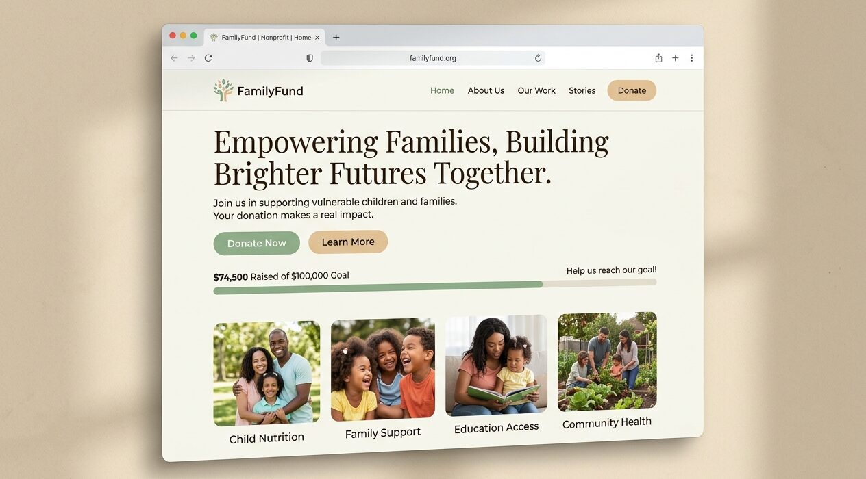
FamilyFund began as a bespoke project for a family-support charity and became the theme we're asked about most. The brief was unusually clear: raise more money, look less like a charity website.
One ask per screen
We removed every secondary call-to-action above the fold. A single donate button, a progress indicator with real numbers, and one photograph of the people the money reaches.
Progress as a first-class block
The campaign-progress block reads from a custom post type, so editors update a number in one place and every template reflects it. Donations rose 31% in the first quarter after launch — most of it attributable to putting the progress bar above the story rather than below it.
Trust is built with specifics. '£41,320 of £60,000' outperforms 'help us reach our goal' every single time.